Which Pokemon card illustrator do you dislike?
I don’t like Tomokazu Kamiya
Comments
-
I have a castform card and the illustration is made out of yarn it looks so bad
1 -
whoever made that illustration I would like to ask why!!! Why!!!
0 -
why!!
0 -
@Pokemaster9293 some artists have specific styles that they stick to, but I agree, they do look kind of weird. Some people like collecting those tho.
3 -
I really like the card artist Naoki Saito, they did the full-art Colress's Experiment which is really beautiful. I don't know any artists that I specifically don't like, though…🤔
4 -
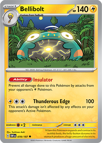
I don't have any who I dislike right now, but I love most of the arts from gen 9, I mean, who wouldn't like this?
2 -
realbreakingnate would be so mad at you right now
0 -
I like realbreaking nate too! @Axobat2012
1 -
I don't mean to be contrarian. I am no art snob. In fact, I am friends with a number of artists and they often find my tastes too mainstream and uncultured.
But I love card art like Tomokazu Kamiya's. I love crude or abstract styles. I love clay models, photographs of sculptures or knitted toys. I love 90s era CGI.
So many card games use stock art. Things you've seen a million times if you are a fan of the franchise.
That is not to say that it is bad. On the contrary, it is often well made and eye catching. That is often part of the reason why something is popular in the first place.
But there is nothing new for you there. Card games, particularly ones that feature multiple printings and unique cards of the same characters, are an opportunity to branch out. To explore art and styles that would otherwise never appear in a video game, manga or anime.
In the early days of Magic: the Gathering, the creators didn't have a lot of money to pay artists. They promised them royalties, but it meant that they would just get whoever they could who "did art".
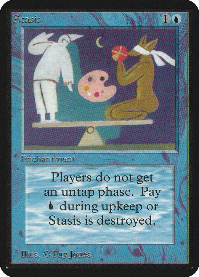
One card, Stasis, from the original set, Alpha, was famously painted by the creator's aunt.
Magic art today tends to follow strict guidelines. All the characters tend to have the same style. It tends to depict people and objects sitting in the world, albeit fantasy worlds.
We do occasionally get more abstract or stylised pieces, but they are often relegated to bonus sheets or premium "secret lair" printings. The cards in the main set follow style guidelines.
Competent. Clean. Boring. And worst of all... forgettable.
Say what you will about the quirky art styles that show up on your cards. Hate them if you will. You have every right.
At least you feel something about them. At least you remember them. Better, in my opinion, than the thousands of cards with safe, competent art you forgot a minute after you saw it.
I wonder, if TPC were to implement strict style guides and insist that every card be on model and produced using the same techniques... how many artists that you love would you lose, or no longer recognise? Would you miss even the quirky art you thought you hated?
At least you felt strongly enough about it to remember it.
5

